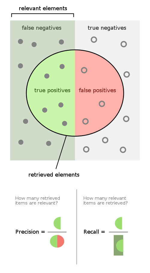
Confusion Matrix:

ROC (Receiver Operating Characteristics) and Area Under Curve (AUC)
ROC graphs are two-dimensional graphs in which tp rate (true positive rate or recall in above diagram) is plotted on the Y axis and fp rate is plotted on the X axis. An ROC graph depicts relative tradeoffs between benefits (true positives) and costs (false positives). More details: An introduction to ROC analysis by Tom Fawcett
For example, when you consider the results of a particular test in two populations, one population with a disease, the other population without the disease, you will rarely observe a perfect separation between the two groups. Indeed, the distribution of the test results will overlap, as shown in the following figure.

For every possible cut-off point or criterion value you select to discriminate between the two populations, there will be some cases with the disease correctly classified as positive (TP = True Positive fraction), but some cases with the disease will be classified negative (FN = False Negative fraction). On the other hand, some cases without the disease will be correctly classified as negative (TN = True Negative fraction), but some cases without the disease will be classified as positive (FP = False Positive fraction).
- Sensitivity: probability that a test result will be positive when the disease is present (true positive rate, expressed as a percentage).
- Specificity: probability that a test result will be negative when the disease is not present (true negative rate, expressed as a percentage).
- Positive likelihood ratio: ratio between the probability of a positive test result given the presence of the disease and the probability of a positive test result given the absence of the disease, i.e. = True positive rate / False positive rate = Sensitivity / (1-Specificity)
- Negative likelihood ratio: ratio between the probability of a negative test result given the presence of the disease and the probability of a negative test result given the absence of the disease, i.e. = False negative rate / True negative rate = (1-Sensitivity) / Specificity
- Positive predictive value: probability that the disease is present when the test is positive (expressed as a percentage).
- Negative predictive value: probability that the disease is not present when the test is negative (expressed as a percentage).
In a Receiver Operating Characteristic (ROC) curve the true positive rate (Sensitivity) is plotted in function of the false positive rate (100-Specificity) for different cut-off points. Each point on the ROC curve represents a sensitivity/specificity pair corresponding to a particular decision threshold. A test with perfect discrimination (no overlap in the two distributions) has a ROC curve that passes through the upper left corner (100% sensitivity, 100% specificity). Therefore the closer the ROC curve is to the upper left corner, the higher the overall accuracy of the test - see next diagram.

The most important metric are the following:
Comments
Post a Comment